Braille stamp design
- Title
- Braille stamp design
- Description
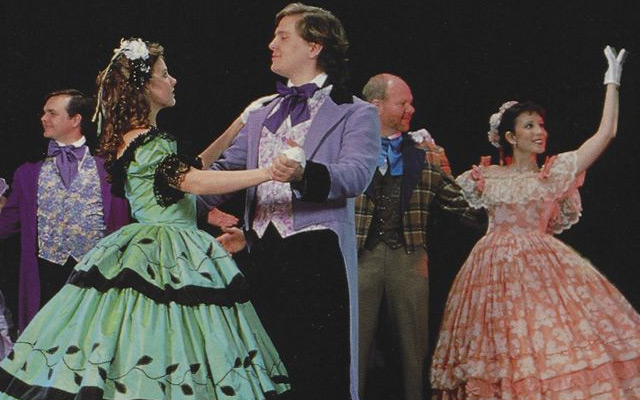
- Graphic design by Anna Vaughn Creech for Fall 2010 in ART4210. Stamp design for the visually-impaired, to raise awareness designing for that sector of our population. The orange bars are meters which abstractly refer to the "visually-impaired friendliness" of each state. They are embossed for tactile appeal, and the Braille type is each state's initials.
- Date
- 2010
- Original Format
- equipment
- Extent
- Local Identifier
- SOAD1732
- Creator(s)
- Contributor(s)
- Subject(s)
- Art and vision disorders
- Braille--North Carolina--Greenville
- Disability awareness--North Carolina--Greenville
- Marking devices--North Carolina--Greenville
- Spatial
- Location of Original
- None
- Rights
-
Copyright for this item is held by the creator, who has granted ECU permission to display publicly. All other rights reserved by the creator. If you are the creator or copyright holder of this item and would like it removed, please contact us at als_digitalcollections@ecu.edu.
http://rightsstatements.org/vocab/InC/1.0/ - Permalink
- https://digital.lib.ecu.edu/52681
- Preferred Citation
- Cite this item
- This item
-
 Braille stamp design
- My Collections Login
- Printable Feedback Form
- Found in theme/project
-
 Fine and Performing Arts
-
 School of Art and Design Portfolio Collection
Related Search Results


Public access is provided to these resources to preserve the historical record. The content represents the opinions and actions of their creators and the culture in which they were produced. Therefore, some materials may contain language and imagery that is outdated, offensive and/or harmful. The content does not reflect the opinions, values, or beliefs of ECU Libraries.
Contact Digital Collections
If you know something about this item or would like to request additional information, click here.
Comment on This Item
Complete the fields below to post a public comment about the material featured on this page. The email address you submit will not be displayed and would only be used to contact you with additional comments or questions.